Why Responsive Image Gallery Is Useful In Website Development?
Website development and designing incorporate several aspects and features to create a website that is not only functional but is also engaging for the users. Responsive image galleries for websites are one such aspect that web developers find necessary for an attractive and aesthetically appealing website. However, when designing a responsive website, an image gallery is a challenging part as there are various ways in which one can design the image gallery for a website. For this reason, ease of use is an important factor that is considered while designing a website, making responsive image galleries a functional approach.
DNG Web Developer is the leading website development and designing company in Ahmedabad offering top-notch website development and designing services to its clients. We are a team of experienced and professional web designers and developers offering functional and easy-to-use websites that meet all your requirements. Websites designed by DNG Web Developer are not only excellent in terms of usability but also have an eye-appealing design to attract more users.

8 Key Points To Follow For Responsive Image Galleries In Website
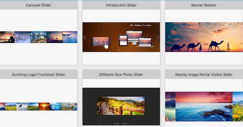
Responsive image galleries for websites is a rising trend and approach in web development. In the responsive image gallery, the image display of the website is equipped with a slider, which helps the user to navigate in between various images which are available on the webpage. One can customize the features of the image gallery such as background color, image duration, speed, etc., and create an attractive image gallery.
DNG Web Developer offers the best solutions for website development with responsive image galleries for websites to its clients. You can get top solutions for your web development needs from DNG Web Developer, which is the top web development company in Ahmedabad, Gujarat. Following are the 10 key rules one needs to consider while designing a responsive image gallery:

Hide Navigating Elements
It is better to hide the navigation elements from the website as much as possible, to avoid conflicting between the website’s content and the navigation elements. This ensures a smooth and positive user experience
Avoid Portrait Images
When designing responsive image galleries for websites, it is best to avoid adding images that are in portrait orientation. This is because while landscape and square images can adjust to the responsive website design of a small or a large screen, portrait images may look very small on a landscape screen.
Use Interactive Navigating Elements
While designing a responsive image gallery, it is best to use navigating elements like gestures which are interactive and easy to use. This is specially useful for mobile application users, as tiny navigating elements can be difficult to use and finger gestures like swipe are more interactive.
Avoid Using Lightbox On Mobile Screen
When the image gallery is designed for viewing images of products on a mobile screen, lightboxes are preferred to be disabled as they can hide important content of the website and negatively impact the user experience of the website. Moreover, if the size of the lightbox is not responsive to the screen, the user may face challenges closing the lightbox.
Carefully Place Navigating Elements
If the image gallery consists of a large number of images, then it is useful to have a navigating element, as it saves the time of the user by navigating to the image of their choice. However, the navigating elements should be placed in such a way that it does not clash with the text or other links on the page.
DNG Web Developer is the best website development company in Ahmedabad offering robust solutions for web development and designing.. We offer websites with responsive image galleries for websites to our clients to choose from. Keep on reading to know more rules while developing a responsive image gallery for websites.
Don’t Combine Images With Videos
It is better when a website designing a responsive image gallery to keep videos and images in a separate gallery. This is because while navigating through the gallery, a user may accidentally play a video, causing unrequited sounds. This leads to a compromised user experience on the website.
Rightly Scale Images
By correctly scaling an image for the responsive image gallery in website development, you can avoid pixelated scaling of images that are too small to fit a space in the image gallery. These images should be large enough to fit to the complete size of the skin and provide an appreciable user experience.
Avoid Captioning Images
It is difficult to fit a caption text for the image to the mobile screen’s size, as it can give a clutter appearance to the website. Moreover, the text can overlay on the image, therefore hiding its content and decreasing the overall aesthetic appearance of the website. Therefore, it is best to avoid adding text to a responsive image gallery.
DNG Web Developer- Best Website Development & Designing Company In Ahmedabad
responsive image galleries for websites is a highly useful addition to every website. It enhances the overall user experience of the website and makes it easier to use and browse through, as users can focus on the information which they require without any hassle. DNG Web Developer is the leading website development and designing company in Ahmedabad.
We provide personalised solutions for all your website development and designing needs and offer best deals. You can easily connect with DNG Web Developer and get a website built from our experienced team. We also offer other services like application development and software development to our clients.


1 thought on “8 Essential Key Points for Responsive Image Galleries for Websites”
Comments are closed.