Color psychology is one of the most vital parts of any website. You can get numerous benefits from color combination for websites. The right color combination can create a good impression of your website and attract more visitors to your site. This positive impression also gives viewers a strong reason to share your brand with friends and family. Smart use of colors can increase your brand’s awareness which is extremely important for your business.
By using appropriate colors, you can also increase email sign-up rates, impress old customers, and give people a reason to share your brand with family and friends.
However, choosing the right color combination for your website is not an easy task. You have to understand the psychology of color combination completely. Otherwise, you cannot use a proper color combination for websites. In this blog, we have mentioned everything about the psychology of color combination for websites. This guide can surely help you to understand color psychology. Keep reading the blog to know more about color psychology.
What is Color Psychology?
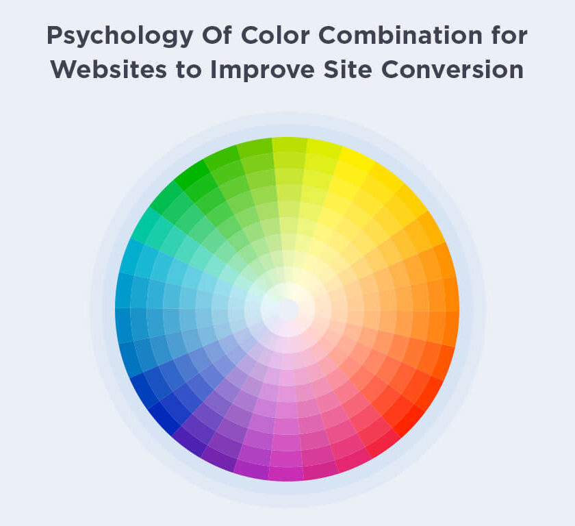
Color psychology refers to the study of how human behavior is affected by different colors.
For so many years, color combination psychology has been used for different purposes. In the psychology of colors, there are emotions, values, and some other reactions that are closely connected to different colors.
In website design, the psychology of color combination helps to attract more and more viewers to a particular site, increase engagements and also improve the site’s conversion.
There are different types of colors that can be combined together and used to create an attractive website. Let’s see how color psychology helps to inspiring website color schemes to choose for engagement increase a site’s conversion.
How the Psychology of Colors Improves a Site’s Conversion
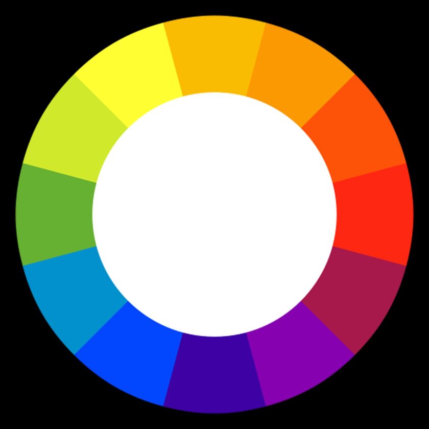
Using the right color combination is not an easy task for some people. Especially if you are new in the web design field, you will face difficulty while choosing the right color combination for websites as there are lots of different colors available in a trending color scheme.
That’s why you need to understand the psychology of color combination and the process of using color psychology in website designing. We have mentioned below how you can improve your site’s conversion by using color psychology.
1. Red Color Can Promote the Clearance Sell

Red colors refer to urgency. So, the red color can help you helps you to promote the clearance sales and attract more people to your website at the same time. So, if you want to improve your site’s conversion, you can use bright red color in various ads and graphics of your website.
Several renowned brands such as KFC, Coca-Cola, Redbull, McDonald’s, Colgate, Nike, Ace Hardware, and many more use red colors on their website to draw the attention of more viewers to their sites.
2. Blue Color Can Build Trust
Trust, security, and reliability are closely connected with the blue color. That’s why it is one of the most popular colors in the business world, especially in the financial industry. Blue can build trust and make your business most trustworthy to all the customers. It can help your site to improve conversion.
Many famous financial companies like Paytm, PayPal, Visa, and many more use this on their website to build complete trust in customers’ minds.
3. Black Color Can Attract More People
Though black color refers to death in many countries, in the advertising industry, this color refers to glamour and elegance. Black can add a unique and elite sense to your brand and product. So if you want to promote your product or brand to everyone, you can use black on your website to create a unique sense and attract more visitors to your brand.
Moreover, black can create an excellent contrast to other elements of the pages and help to highlight the important elements of your web page.
4. Yellow can Give Your Website a Friendly Look

The yellow color can cheer everyone up. It can give a welcoming, charming, and friendly look to your website. It can also give a professional look to the content of your site. This can impress your readers and attract them to your colour contrast principles in website designing .
5. Use Green to Put Your Customers at Ease

Green color can be used to put your customers at ease. Green refers to good health also. So you can use green to assure your viewers that all the content of your site is healthy and lively. Your viewers will feel that your products and service are good enough.
Final Verdict
Undoubtedly, color psychology is the most vital part of any website, and you should not overlook it if you want to make your brand most popular and successful. You have to understand the psychology of color combination if you want to use colour schemes for website design efficiently on your website. Choose psychologically-appropriate colors to make your website attractive but soothing.
If you want the most attractive website to draw the attention of more people, then you can contact DNG Web Developer. DNG Web Developer is a popular name in the Web development field. Our expert team is able to create amazing and attractive websites for any business.
Get the most amazing website with a smart color combination for websites at an affordable price from us.


